
A datatable element in Flexcard is used to fetch the data from a data source and display it in a tabular structure.
In this article, let us see how to enable grouping and pagination in the Datatable element of a Flexcard.
Create a new Flexcard, and from the ‘Setup’ tab, add a data source to fetch the records to be displayed in the datatable.

In the example, a data source of type DataRaptor is added, and an Extract Dataraptor ‘DRGetCaseDetails’ is added.
In the Input Map section, add a new ‘Key-Value’ pair.
Key holds the variable to be passed to the data source. Value holds the value of the variable.
Here, Key : AccountId and Value : {recordId}.
Click ‘Save & Fetch’ in the datasource.
When the Flexcard is added to a lightning record page, the record Id of the record will be automatically stored in the global context variable {recordId} and passed via AccountId to the data source.
The dataraptor DRGetCaseDetails retrieves the details of all the Cases linked to an Account (based on the AccountId passed).


Disable the Repeat Records checkbox.

Now add a datatable element to the Flexcard.
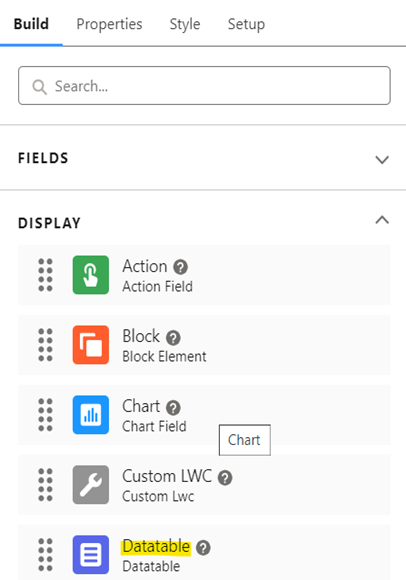
The datatable automatically shows data from the added data source.

Optionally, in the Datatable Properties section, click Column to modify the behavior of the datatable columns based on the need.


In this example,
The order of columns (CaseNumber and Subject) is modified.
The Field Label attribute of the column CaseNumber is updated to Case Number. This displays the new column label in the datatable UI.
The Is Visible attribute of the column Id is set to False. This hides the column in the datatable UI.

Enable Grouping:
In the Group Attributes section of Datatable Properties, we can configure the attributes to group the datatable rows.

Group By: This attribute allows the datatable rows to be grouped together based on one particular column (field).

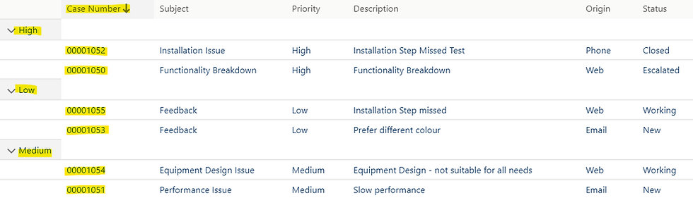
In this example, Priority is entered in the Group By field. This groups the Case records based on the Priority field values: High, Medium, and Low.

Group Order: It sorts groups in ascending or descending order. By default, the sort order is ‘Ascending’. It can be changed to ‘Descending’ if needed.

Here, the Group Order is set to Descending, and so the groupings are displayed in descending order as Medium, Low, and High.

Active Groups: This expands all groups if enabled. If disabled, all the groups will be collapsed by default, and user can expand the groups manually when needed.

In this example, since the ‘Active Groups’ checkbox is disabled, by default all the groups are collapsed.

When the user clicks a particular group, the corresponding rows are expanded.

On enabling the ‘Active Groups’ checkbox, all the groups are expanded by default, as shown below.

Hide Extra Column: This attribute removes the extra column that holds the group values when enabled.

In this example, the extra column holding the group values is removed, and the group values directly appear in the first column.

Sort Across Groups: When enabled, this attribute sorts both the groups and the rows within each group when the column header is clicked. When disabled, sorting happens only within each group when the column header is clicked.

In this example, the checkbox is enabled, and now when the ‘Case Number’ column header is clicked to sort in descending order, first the groups will be sorted in descending order as Medium, Low, and High.
And then the rows within each group will be sorted in descending order, as shown below.

Now, when the checkbox is disabled and the ‘Case Number’ column header is clicked to sort in descending order, only the rows within the group will be sorted in descending order, and the groups are not impacted.
Enable Pagination:
In the Attributes section of the Datatable Properties, we can set the pagination attributes.

Page Size: This attribute allows us to set the number of records to be displayed on each page of the datatable.
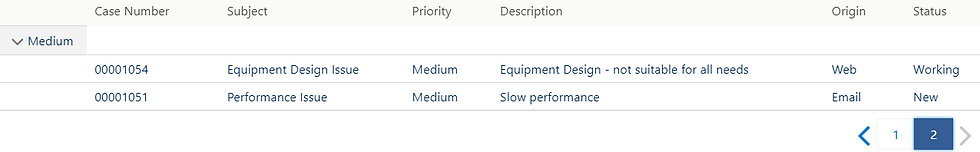
In this example, Page Size is set to 5 and there are six Case records linked to the Account. Hence, two pages are created: the first page contains the first five records, and the second page contains the sixth record.


This behavior is applicable only if the ‘Page Size’ attribute is set but the ‘Group By’ attribute is not set in the datatable.
If both the ‘Page Size’ and the ‘Group By’ attributes are set, then the ‘Page Size’ is determined by the number of groups instead of the number of rows
in the datatable.


In this example, since both attributes are set, the datatable shows two groups and the corresponding rows on the first page, and the third group rows on the second page.

Page Limit: This attribute allows us to limit the number of pages displayed in the datatable. To use this attribute, the ‘Page Size’ attribute must be set.
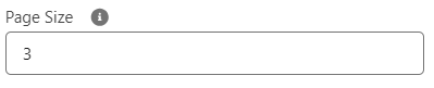

In this example, Page Size is set to 3, and Page Limit is set to 1. Though there are six Case records, only the first page with three records will be displayed in the datatable.

References:
Thank you for the valuable information. Is it possible to implement lazy loading on the dataTable instead of pagination? In this way, the records are displayed in the datatable as you scroll down? greetings!