
Let's see how to design the tab structure using the block element of the Flexcard:
1. Drag and drop the Block element.
2. From the Style tab of the Block element, add borders to it as shown in the image below.

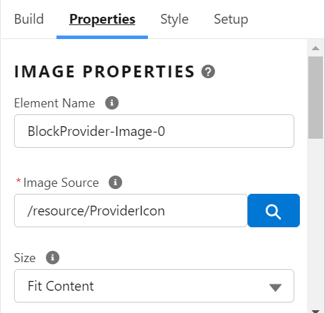
3. If we want to display an image in the tab structure then drag and drop the Image element inside the block element added above and add the link of the Static Resource in the Image Source as shown below.
4. To display a text or title for the tab structure, drag the Text element inside the block element added above.
5. Style the text as per the requirements, from the Style tab.
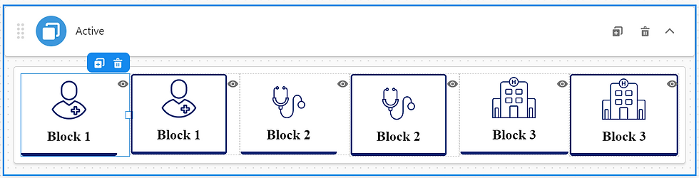
6. Now clone the Same Block using the Plus Icon, as shown below such that one block will be used to show the tab as selected and the other one is used to show the tab as not selected.

7. Now style the cloned block as the selected tab as shown below such that one looks like selected and the other looks like not selected:

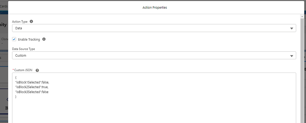
8. Click on the card and go to Setup and add the data source as Custom and add the Custom JSON as shown below

9. Now add the conditional view to the block which is not selected, as shown below.

10. Click on the block which should be visible on select, and add the conditional view to the properties of the selected block as shown below.

11. Now on the block which will be shown on select, add action as shown below.

12. Repeat the Steps from 1 to 11 for Block 2 and Block 3. The Final Result of the Block should be like the below image.
13. Then on the selected block2 and selected block3 add the action and make “isblock2selected” to true and “isblock3selected” to true respectively as shown below:

14. Finally, it will look like below


not able to understand the functionality